We all know that colors impact people’s feelings and behaviors, but how do we know which colors are the “right” ones to elicit the responses we want from people?
In stores, color choice impacts many aspects of the retail experience, from customers’ dwell time in your store to their spending habits. In fact, according to research conducted by the South African interior design company DDL Design & Décor Lab, 84.7% of consumers cite color as the primary reason when they buy a particular product.
Thankfully, we now have more knowledge about color psychology than we did in past decades. By exploring some tried-and-true practices for color selection in retail, you too can ensure that your brand conveys its intended message and draws in customers.
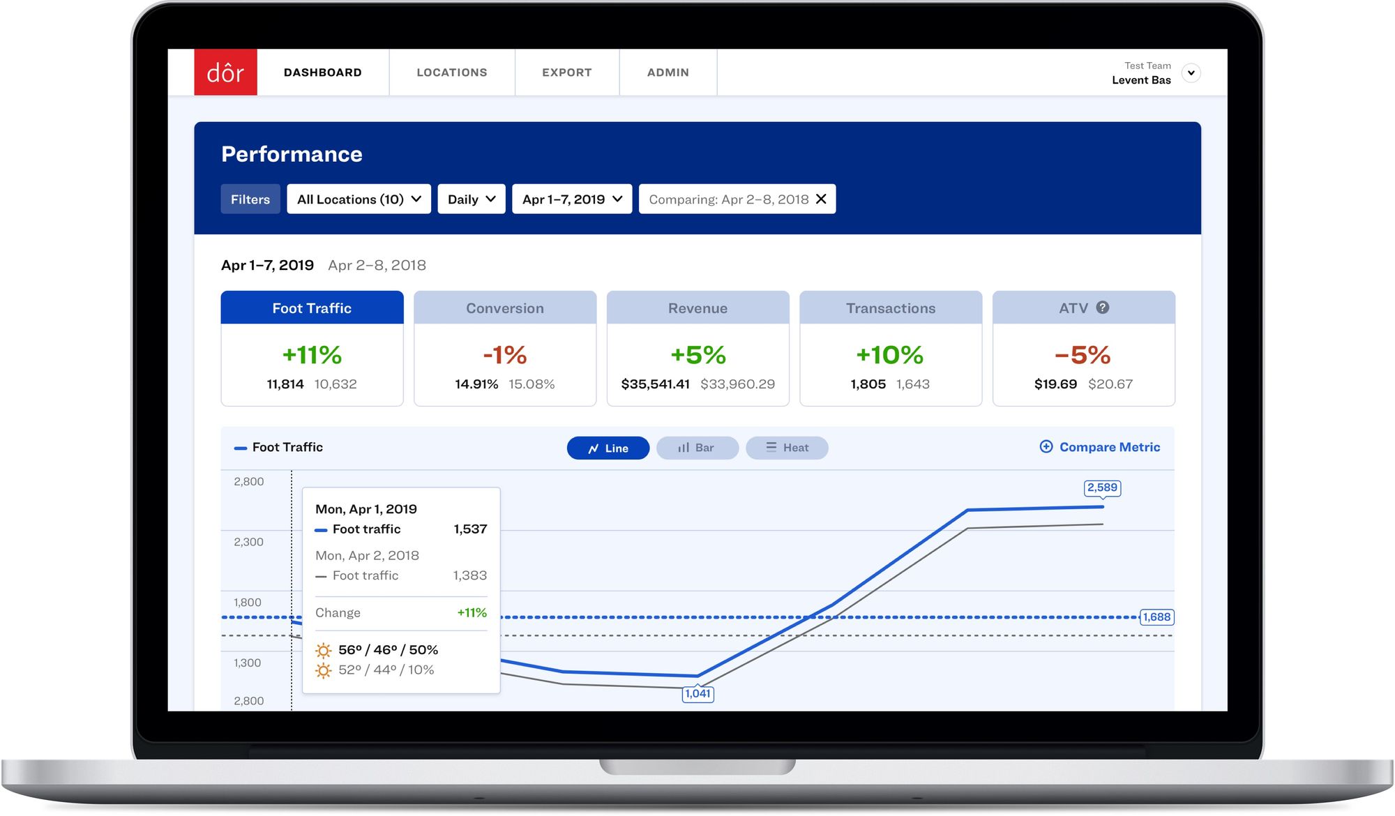
Did you know that a 1% increase in your store’s conversion rate can mean a 10% increase in revenue?
Click here to discover how Dor can help you understand your foot traffic data and make more profitable business decisions.
Ready to purchase? Complete your purchase in just minutes!
1- Color can be a powerful tool to communicate the “mood” of your brand to customers
We all know that first impressions matter, and in the case of first-time shoppers discovering your store, your choice of color can be a great tool in communicating your brand’s ethos.
Generally speaking, warm colors such as reds, oranges, and yellows have an energizing effect on people, as they remind us of natural elements such as fire and the sun. By contrast, cool colors such as blues, greens, and purples subliminally connote elements such as water or grass, thus creating a tranquil and relaxing mood. It’s up to you to choose the color family that best represents what your brand stands for.
2- Color should also play a crucial role in your logo design
As a retailer, your color selection isn’t limited to the design of your store—you also have to consider the elements which represent your brand in the eyes of your customers.
Your brand logo is easily the most memorable aspect of your store identity. As such, it makes sense that you would want to spend a considerable amount of time and brainpower to create a logo that reflects the core idea and vibe of your brand. You can look at examples of successful logos from related brands or consult design blogs to discover best practices for color selection for your specific retail branch. You could even create a survey to test various logos and receive feedback from trusted industry professionals.
3- Most popular and unpopular colors in retail logos
While we’re on the subject of logos, let’s look at some real-life examples from the world of retail.
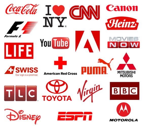
One of the most popular logo colors across all industries is red, as it grabs the eye—pay attention, and you’ll see it on the logos of a wide variety of brands, from entertainment and news outlets such as Netflix and CNN to retailers like Target and GNC, among many others. Red is especially popular with restaurants and food retailers, as the color is believed to generate appetite (think of Coca-Cola’s iconic white-on-red as well as McDonald’s’ iconic yellow-on-red logos).
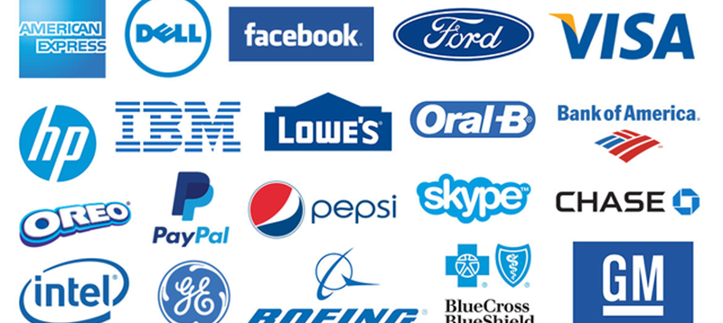
Blues are also a popular choice for retail brands, especially those in the tech field—from industry giants like Samsung to more new-generation tech brands such as Zoom, Skype, and PayPal. This is because blue—often associated with natural elements such as the sea and sky—creates a feeling of security in people, thus priming customers to trust the brand.
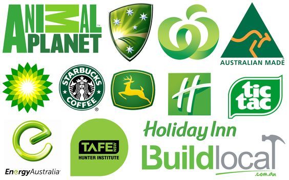
Last but not least, green is another popular color, as it bears connotations to plants and nature. Companies that wish to evoke a more eco-friendly perception sometimes choose green for their logos, like the oil giant BP or the auto manufacturer Land Rover, or food retailers such as Whole Foods and Starbucks. Green is also occasionally used to imply money and savings, as in the case of discount variety store chain Dollar Tree’s logo.
Least popular colors in retail:
According to a study by Australian freelance design services platform 99designs on popular color palettes in retail, the least popular colors for retailers are brown, pink, and purple. Why? “These colors are considered niche, as certain demographics love them, but all other demographics hate them,” concludes 99designs as to their unpopularity.
4- Your brand identity matters in your color scheme selection
While it is essential to know the general effect of colors on consumer psychology, you must also consider the type of store you run and the ambiance you wish to create there.
While bold colors create an energy-filled atmosphere—perfect for retailers of cutting-edge or niche products—lifestyle-oriented brands may opt for a more pared-back color scheme to create a calming ambiance.
Another essential aspect to consider is the why behind your color choices. For example, do you wish to draw attention to every visual element throughout your retailer, or would it make more sense to highlight certain features instead? Questions such as these are crucial to the ultimate success of your design.
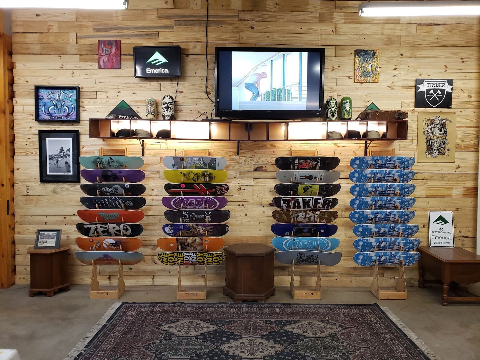
Take for example Timber Skate Shop, a local skate shop in Pennsylvania that keeps its decor relatively neutral and minimal, thus highlighting its colorful merchandise instead.
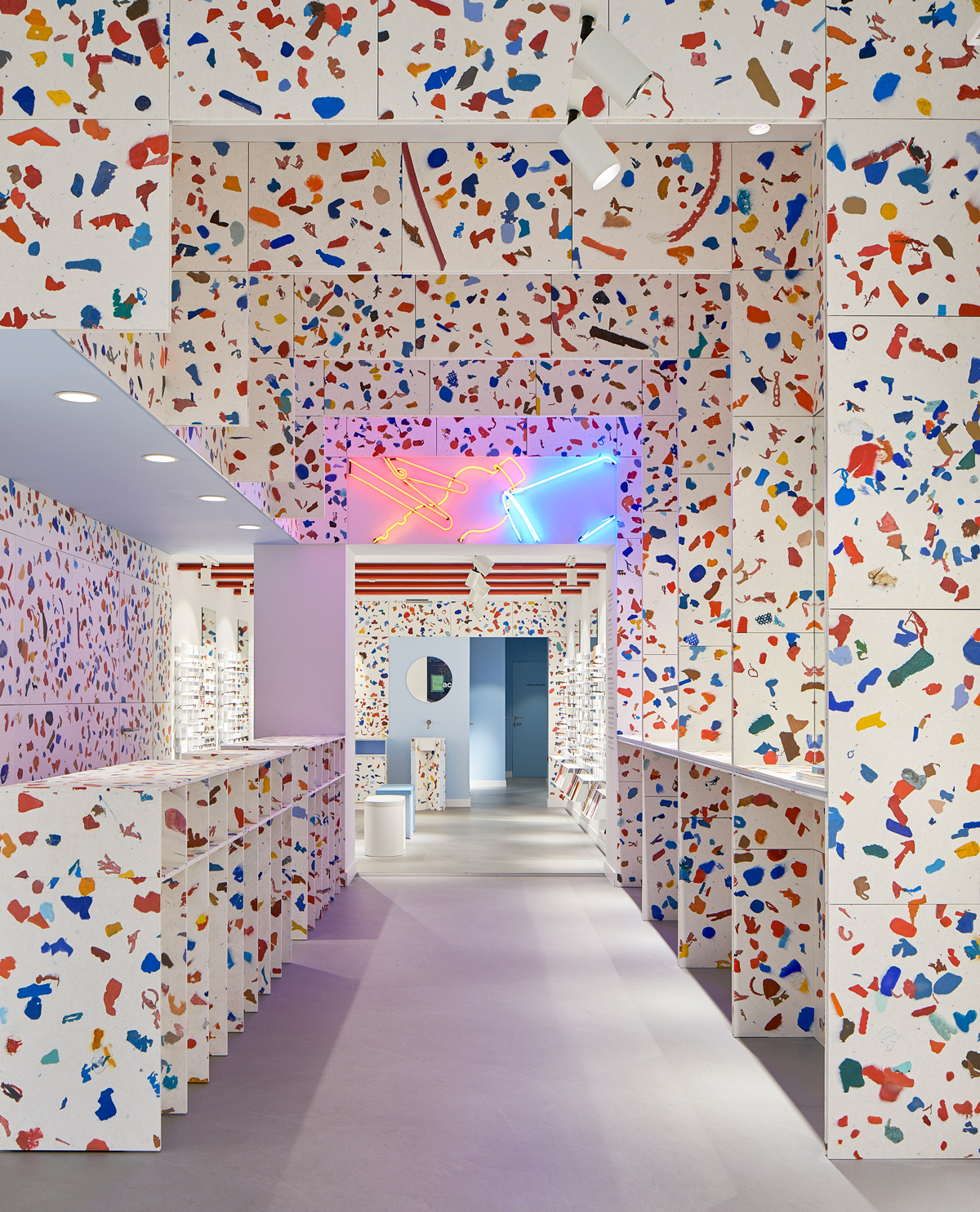
By contrast, check out eyewear brand Ace & Tate’s Antwerp store, which infuses an almost dizzying array of color and patterns into its decor to create a fresh and modern ambience.
5- Color can help you perfect store design and layout
The color palette used throughout your store also plays a vital role in drawing customers. The above-mentioned study by DDL Design & Décor Lab also found that 52% of shoppers did not return to a store due to overall aesthetics.
To avoid turning potential customers away, consider how you can use color to improve your store’s layout by adopting one or more of these ideas:
Merge function and aesthetics with creative solutions
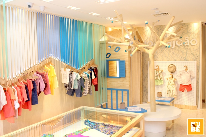
Check out this cool and creative hanging feature from Brazilian kidswear brand Joana João, which proves that you don’t need to shell out big bucks for an interior design firm to re-do your entire store—with a bit of ingenuity and the right materials, you can get creative.
Draw in customers with captivating window displays
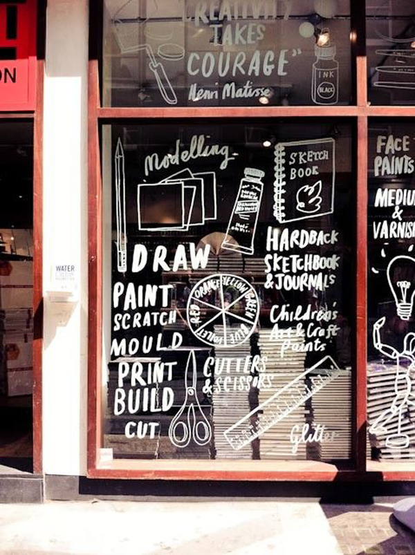
This window display for an arts supply store proves that sometimes, less is more. While white may not be the most colorful option out there, the store’s choice to create a monochromatically white window display was a success, as the result is both attention-grabbing and inexpensive to create. Not only that, but it does a great job of clearly communicating to customers exactly what they can expect to find inside the store.
Divide the store into sections
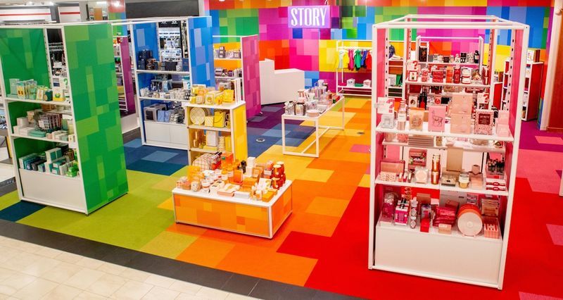
This iteration of Macy’s pop-up retail concept STORY may seem too colorful for any one section to hold the customer’s attention for a long time effectively. Still, once you look closer, you’ll notice that each section is color-coded to match the hues of items featured in that section. While you may not have the same interior design budget as Macy’s, you can get creative with everyday materials—you can even take a cue from this bored employee and create a wall mural using Post-Its!
Related: How to Design Retail Store Layout to Increase Sales
6- Use color sensibly to differentiate employee uniforms
Another important aspect of your visual merchandising is your employee uniforms, as choosing the right color for your employee uniforms will ensure that they always look presentable. In addition, your customers can spot them in a crowd of people.
Take for example electronics retailer Best Buy, whose employees all wear the brand’s signature blue to easily find and assist customers in store.

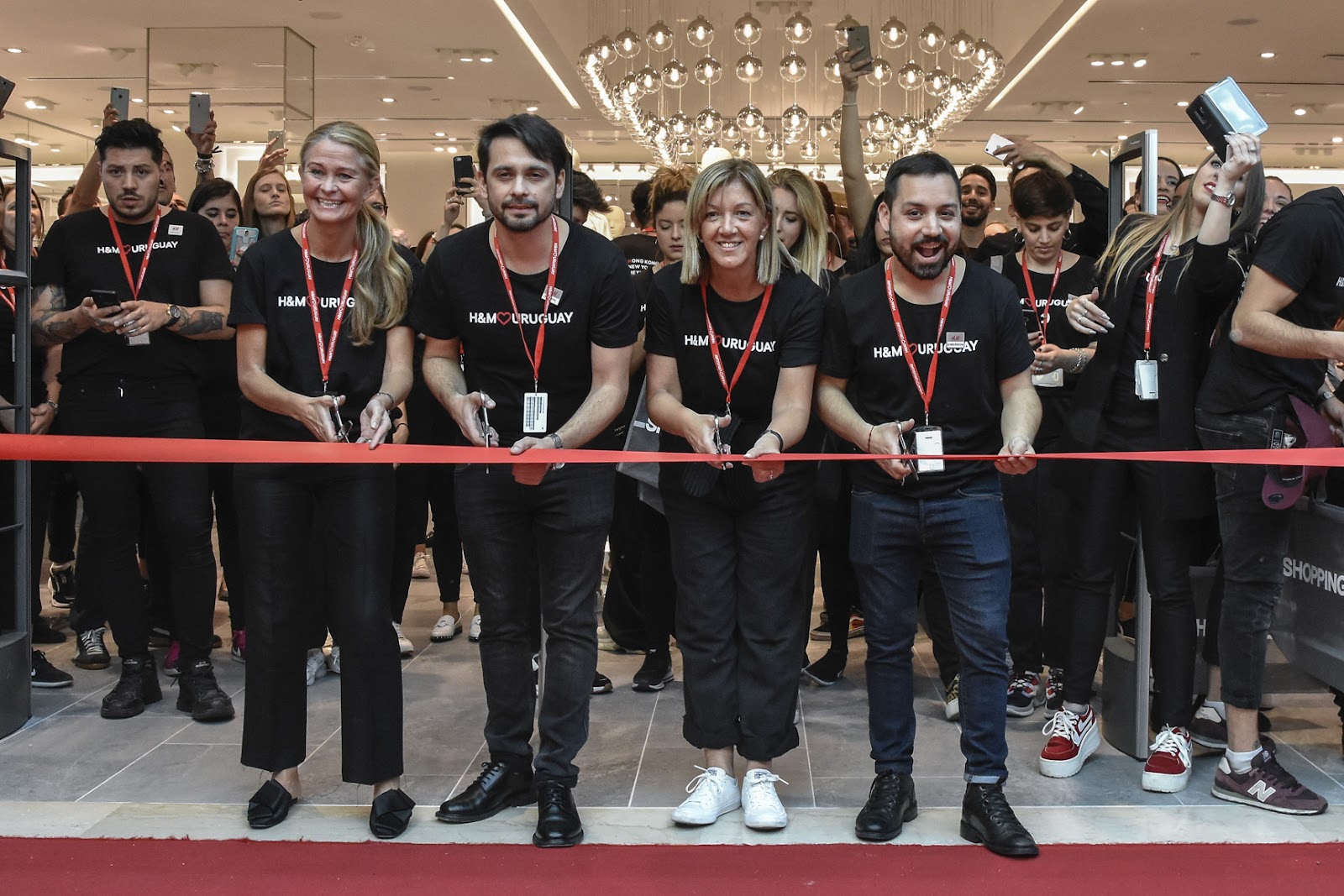
Of course, you don’t always have to match your employee uniforms to the color of your brand’s logo. Sometimes, it’s a good idea to have your sales people wear colors that complement your brand’s main hue instead. For instance, despite H&M’s logo being red, its employee uniform is a plain black t-shirt—which not only complements the brand’s red-and-white color scheme but also ensures that the employees all look polished and put together.
On that note, it’s also a good idea to reserve darker colors such as black or navy for managers, which will help both your staff and your customers easily identify them.
7- You can use color to your advantage when communicating deals to customers
Last but certainly not least is the signage you use throughout your store to guide or share information with your customers. Here, font selection is just as important as your color choice: You want to opt for something that puts forth your brand identity, whether that’s best conveyed through a more serious and professional font or a more modern and fun one.

When it comes to signage, using complementary colors—those that sit opposite the primary hue on the color wheel—can create a bold effect, making certain information “pop” in shoppers’ eyes. One place where it’s a good idea to use complementary colors to your main one is when communicating promotions and discounts to customers.
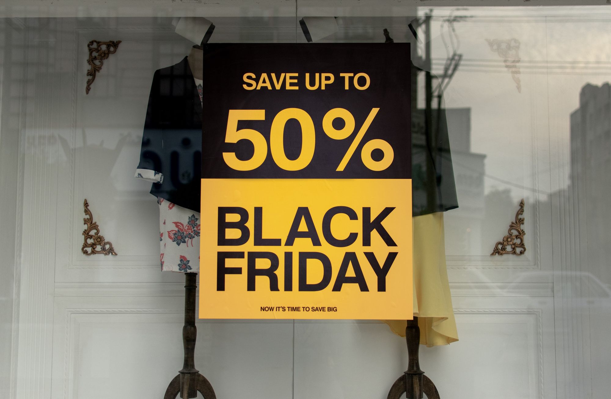
Of course, you can always go the tried-and-true route and opt for a classic red when promoting deals, as the color is guaranteed to grab the attention of store visitors.
8- Colorful signs are a great way to indicate your hours of operation
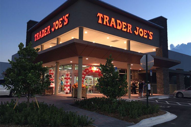
Another place where color can be used to your advantage is announcing your store's opening and closing hours. One idea is to use illuminated signs in bold colors to indicate to customers when you’re open, even from a distance. For example, the famous grocery store chain Trader Joe’s, whose bright-red illuminated sign announces that the store is open to drivers-by.
Hi there! If you liked this post, please feel free to share it on social media to help us reach out to more retailers like you. You can also leave a comment below and let us know if you have any questions!
Start counting your foot traffic now
Get data faster with the world’s first thermal-sensing, battery-operated people counter